


Some time ago I started a small personal challenge to push my creativity and to get some exercise. I called it “Logo for everything”. The idea is to make a “logo” for whatever random word comes to mind. The goal is to express the meaning of the word through typography, colour and shape. This is a free time, just for fun project, so I gave myself a timeframe limitation: the creation of a “logo” should not take more than 60 min. I wanted to keep these simple and experimental as an exploration of style, ideas and possibilities. The purpose of this project is not to create real logos or client work. I chose common words with a clear meaning, so I don’t need to spend time on research and getting to know a business idea, culture, etc. I allow myself the freedom to come up with impractical solutions, that wouldn’t work in “the real world”. Legibility is not a primary concern as it would be in a real logo. I started this little exercise as often in client’s work I miss the freedom to be artistic and let my creativity flourish, I miss going a bit crazy, so this is the place to do it!
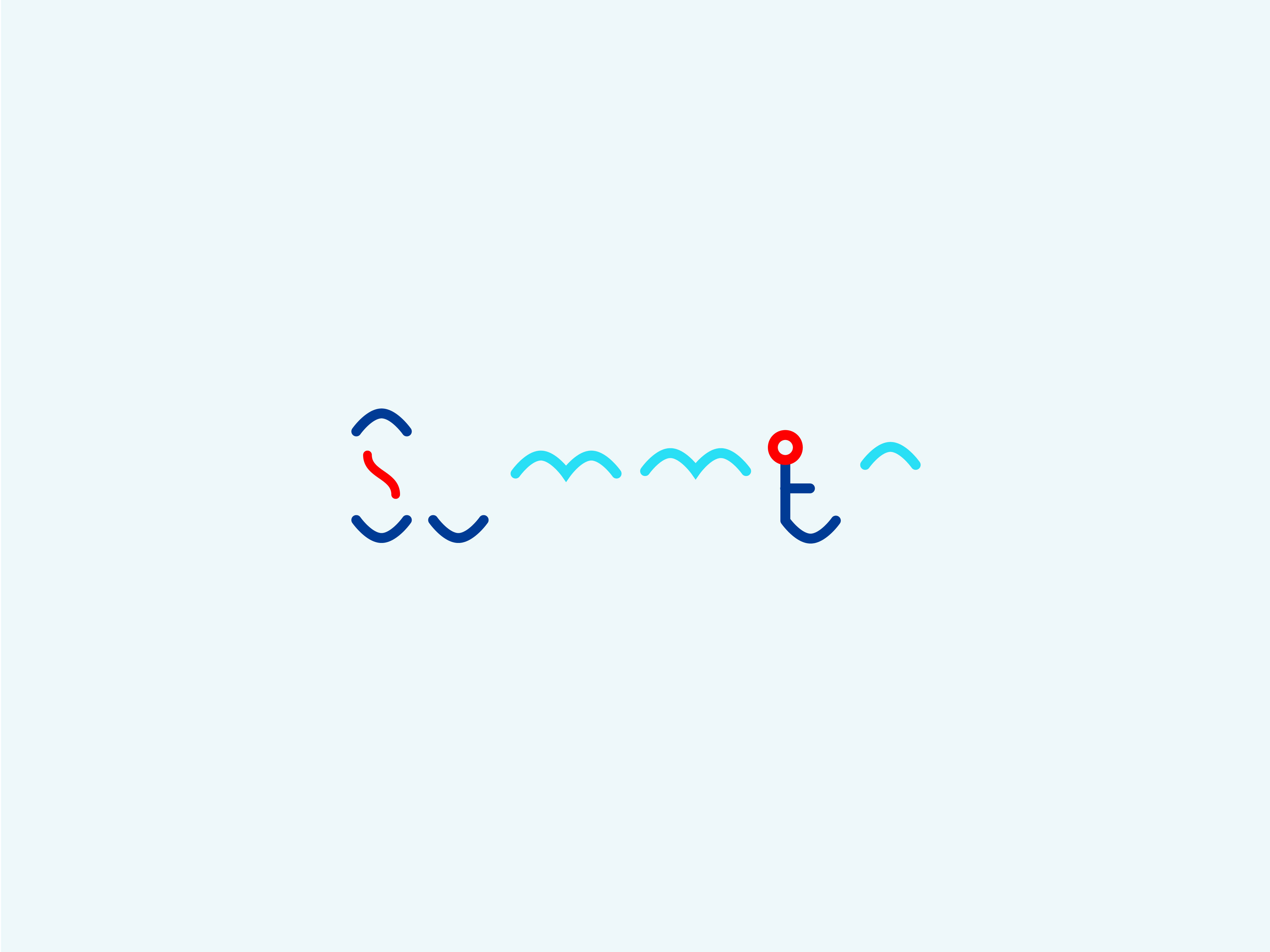
I started with one of my favourite things- summer. I chose a nautical theme for it both in colours and shapes. I tried to draw associations with water, waves, sailing, seagulls and heat.
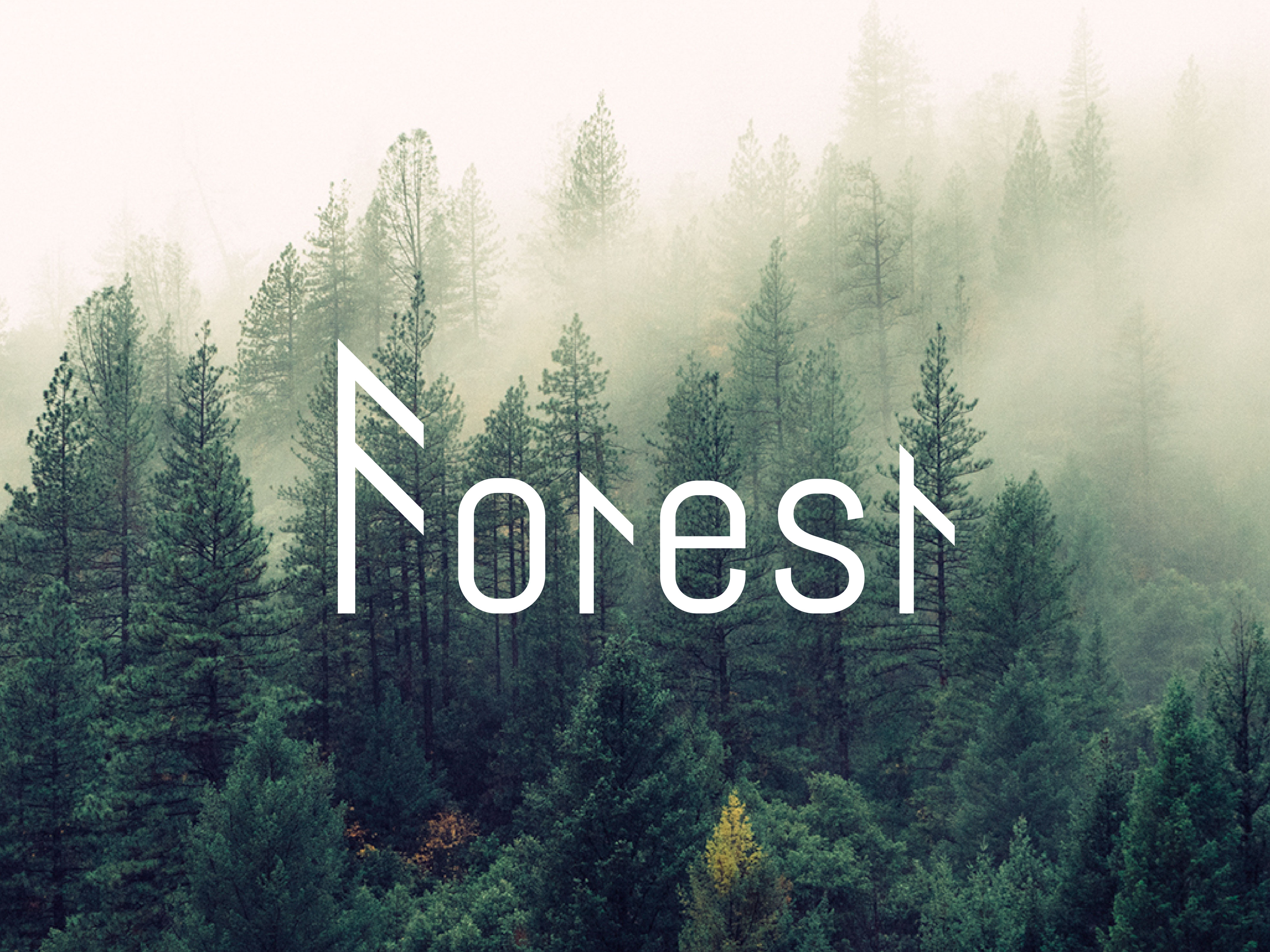
Another favourite thing: forest. Here I tried to suggest a simplified pine tree shape in the “F”, “r” and “t”.

Next is another favourite of mine- mountains. I wanted to form a mountain silhouette shape with the letters.
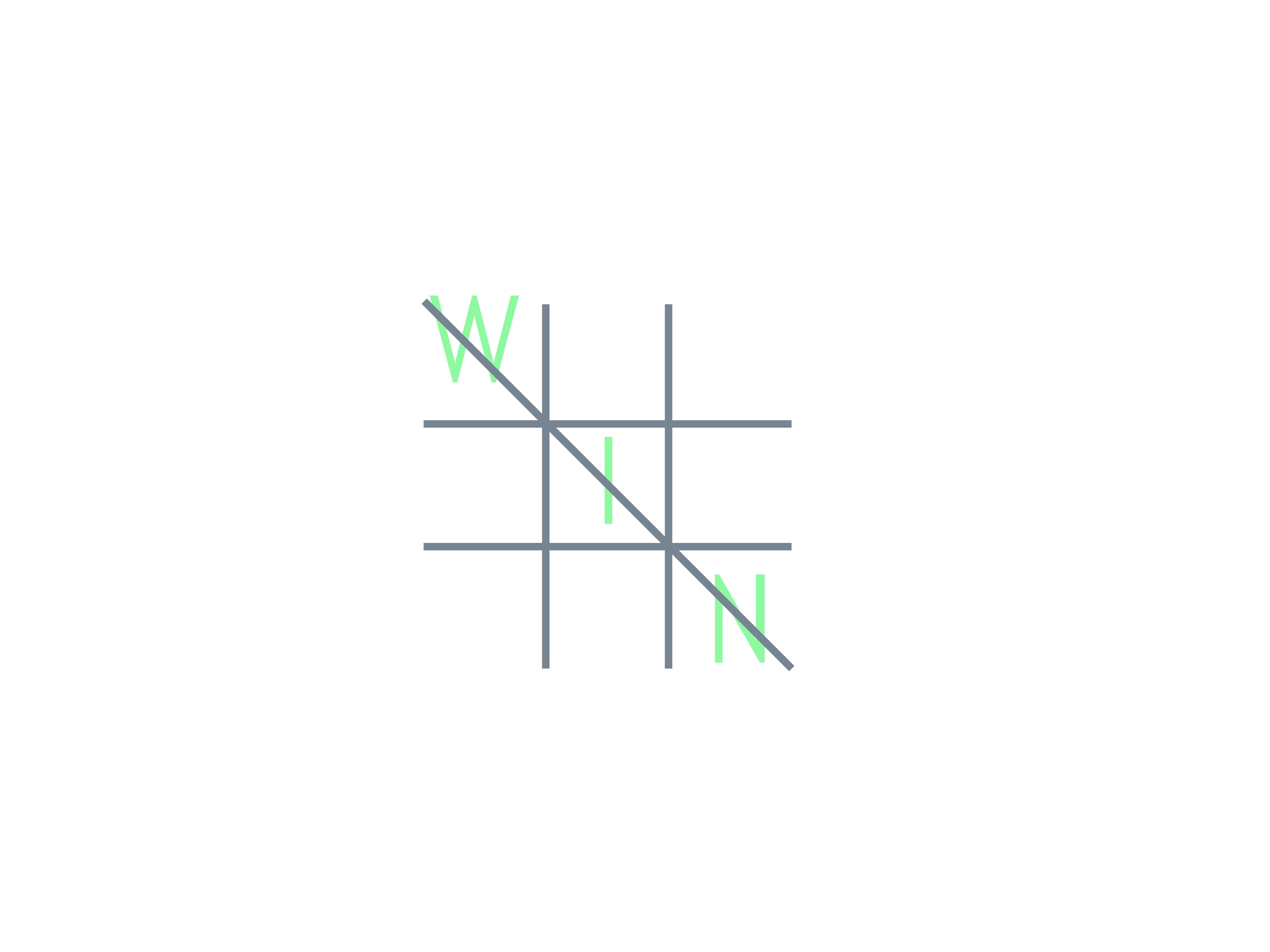
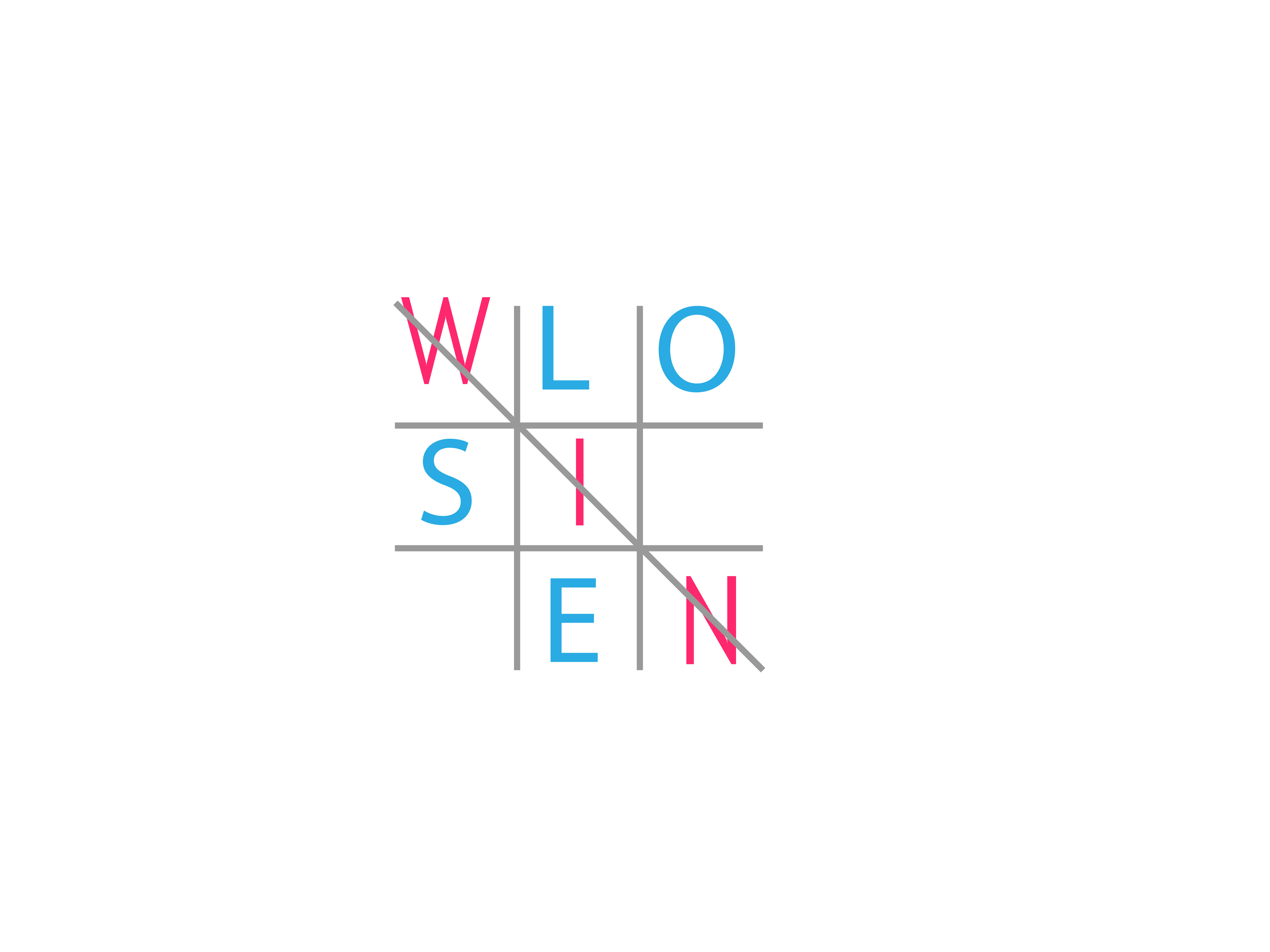
That was a fun concept- using that popular game, the name of which eludes me…
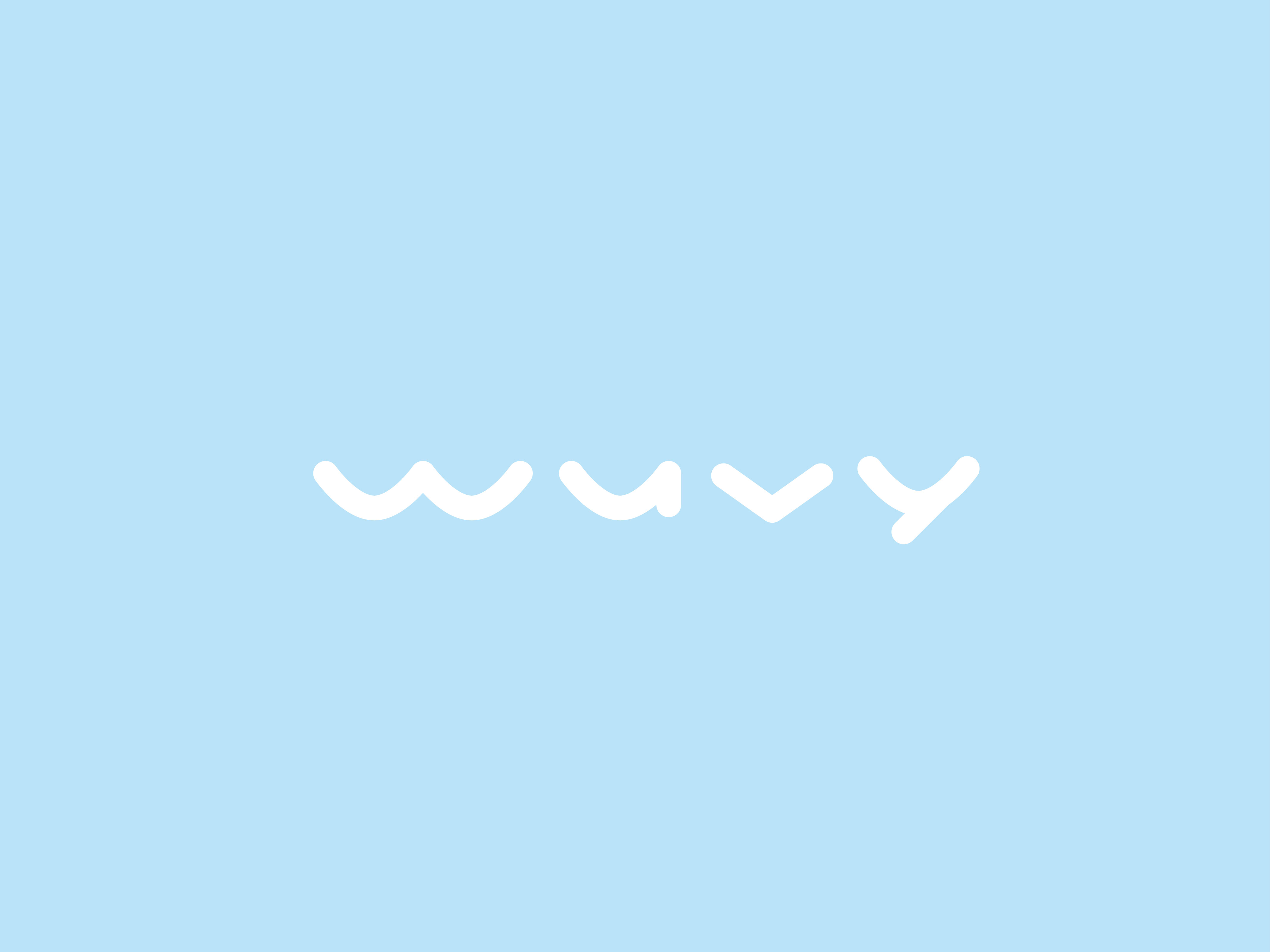
This one came as a continuation of the “summer” concept. I just wanted to play more with those wavy shapes.

The idea here is pretty straight forward, I think: just using those sound bar thingies to write the word. Now that I look at it, I kind of want to make a wave shape out of it, because… sound waves! Maybe in the next round…
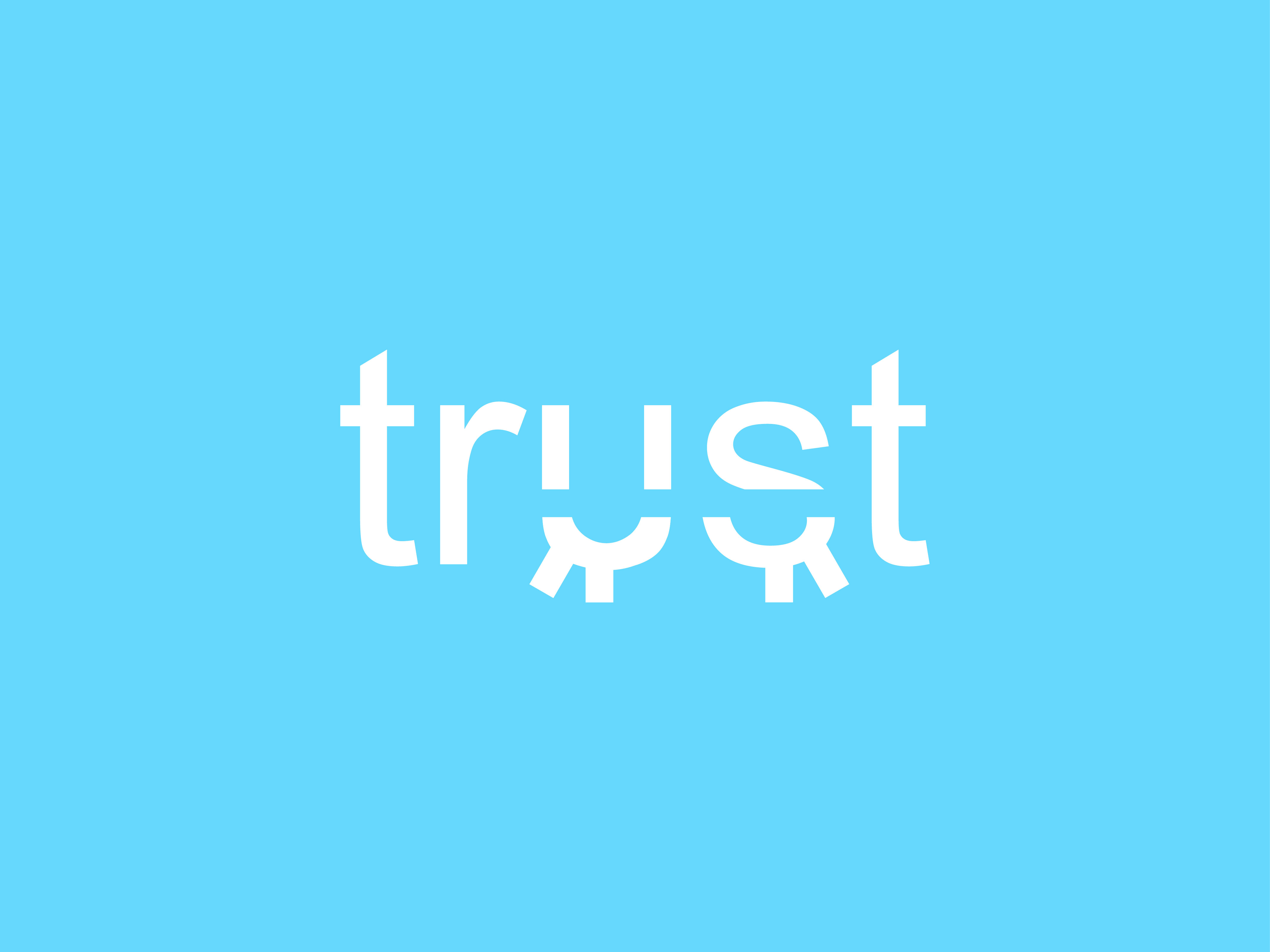
The idea behind the concept here comes from a trust exercise in partner dancing, where the follow has to close their eyes and trust the leader to move them safely across the dance floor.
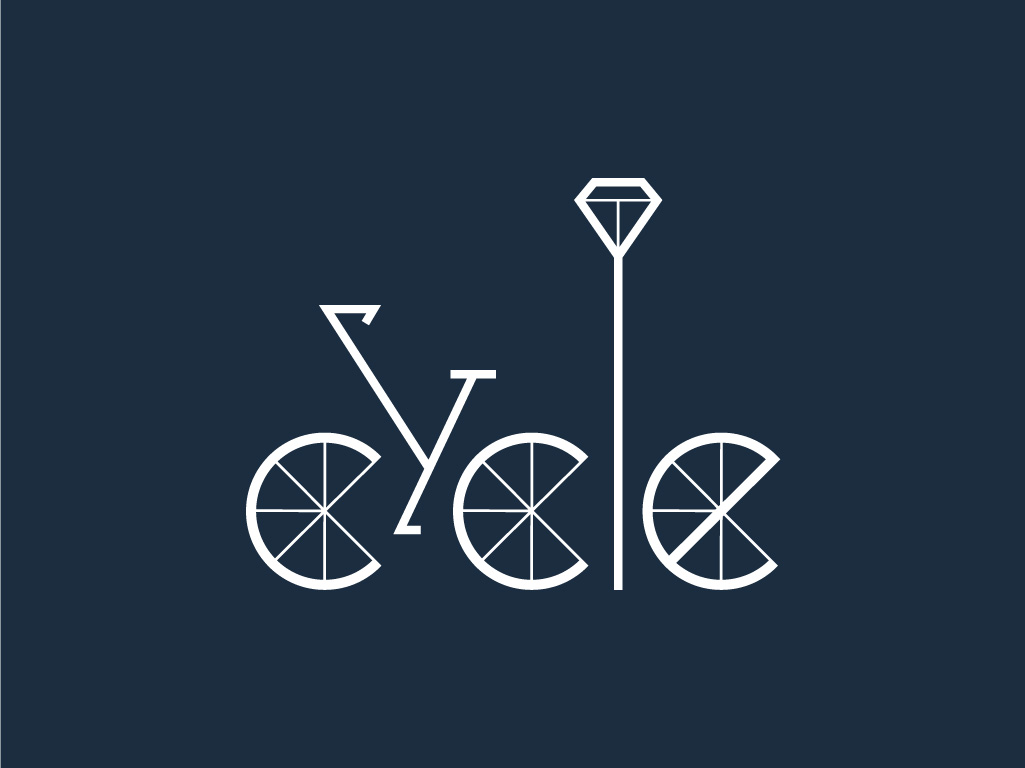
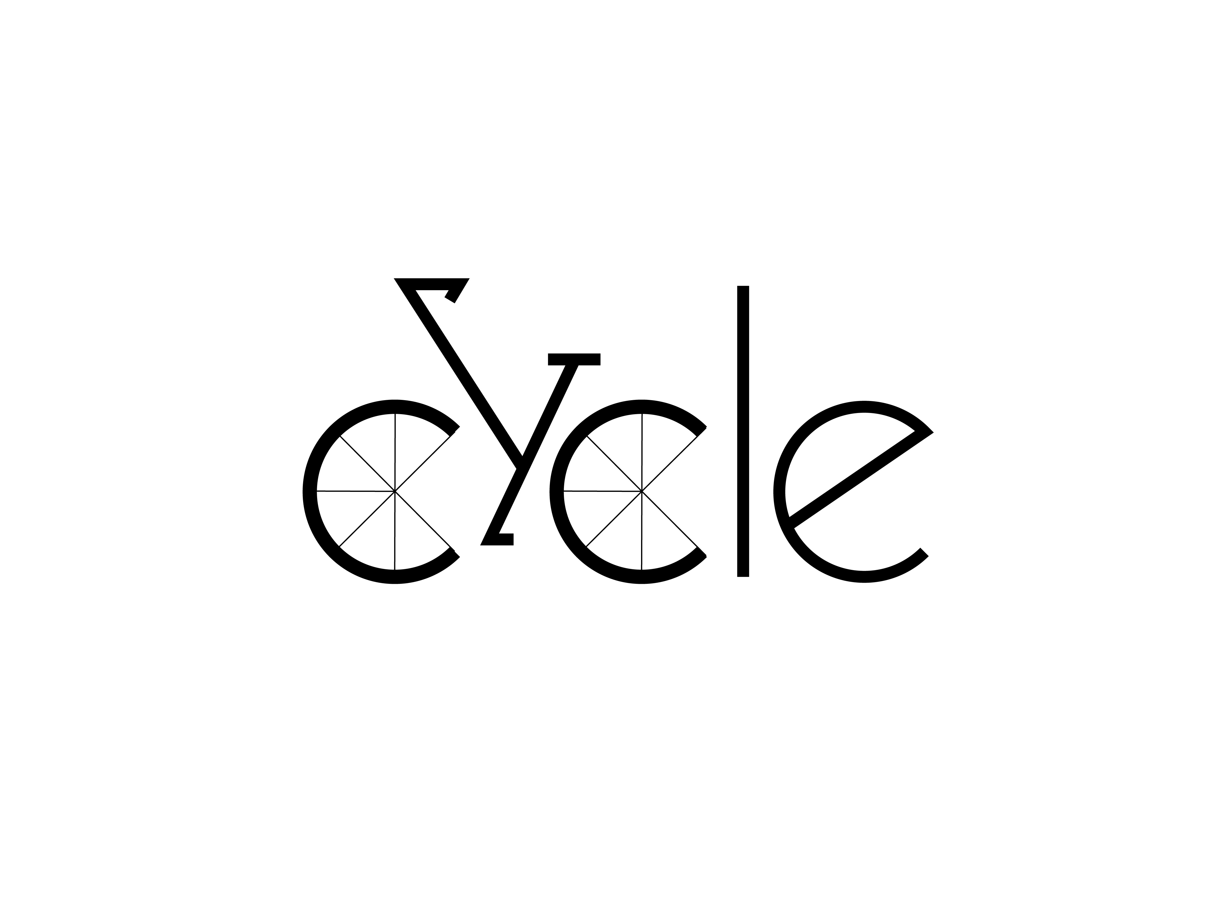
You can’t live in Copenhagen and not think about bicycles. A lot! So here I tried to hide a little bike into the word and with the leftover letters I just made a street lamp and what I presume to be the front tyre of another bike…

Summer got its own conceptual logo, so winter must have one too! I chose thin black strokes and angles on white background to represent tree branches with no leaves in snowy environment. I wanted the “logo” to be angular and somewhat hostile, to radiate coldness and detachment.
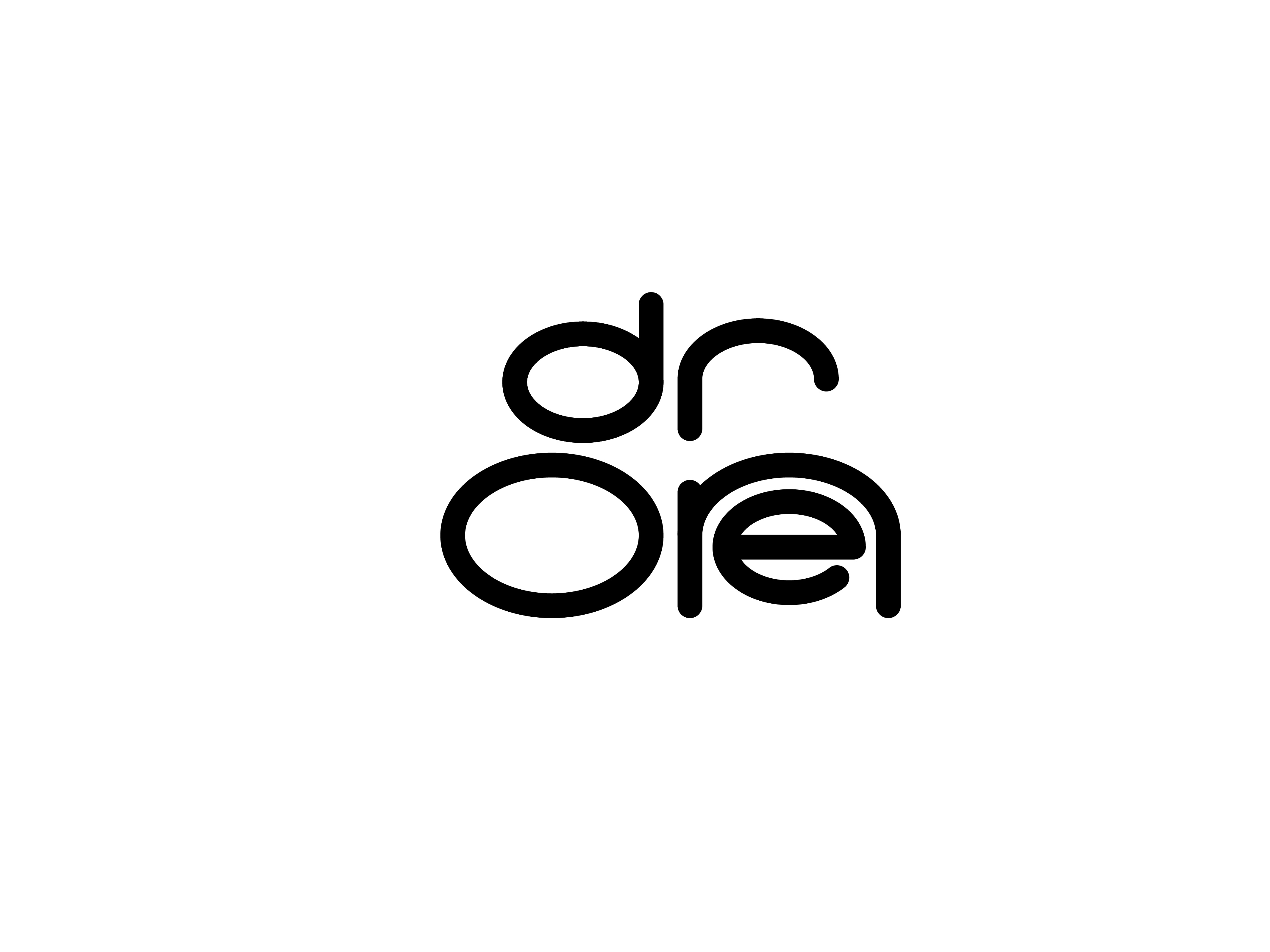
I’m sitting next to bunch of drones all day, so this is how this concept happen. I used the shape of a very basic simple drone to create the letters. Wish there wasn’t an “e” in the end, would have worked much better!
I expect to add more to this collection in the future, but this is it for the moment.


